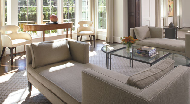
Architect Jim Rill added new bay windows at the front of the house to fill the living room with daylight.
Architect Jim Rill’s vision for renovating a modest rancher in Potomac, Maryland, came to fruition only after the house was sold. Rill had reconfigured the back of the home for a couple before they moved away; the new owners hired him back to undertake the remaining work.
The husband and wife who purchased the home are entrepreneurs who collect art and vintage cars, and frequently entertain out-of-town guests. The two initially viewed Rill’s redesign of the Potomac house as an opportunity to create a retreat where they could host their visitors.
Rill revamped the front of the house with gabled bays and a portico.
“They asked us to create a sophisticated setting with lots of light and a connection to the outdoors,” says Rill. The Bethesda architect fulfilled the expectation by adding bays and dormers to the front of the house and opening the rooms at the rear to stone-paved terraces and a swimming pool surrounded by mature-growth woods. On approach, the house presents what he calls “European country style” with dark trim, overhanging shake roofs and a graceful portico.
Inside the house, Rill worked with Chevy Chase interior designer Jodi Macklin to create a calm setting through tailored furnishings and subdued colors. The quiet, mostly neutral décor serves as a backdrop for the owners’ collection of colorful paintings and sculptures. “The owners were coming out of a much darker, more traditional house,” says Macklin. “They wanted a change to a more contemporary design, but one that was livable—not cold.”
Throughout the renovated home, the architect’s attention to detail is evident in graceful moldings, wainscoting and trim, and rhythmic changes in ceiling heights. “Having such great bones,” says Macklin of the architectural detail, “helped me design the rooms.”
For the living room, designer Jodi Macklin selected Dunbar seating and a glass table from Salvations Architectural Furnishings.
At the front of the house, Rill expanded the original living room to create a sunny, double-height space. Macklin did her part to maintain the airy feeling by choosing tête-à-tête seating instead of conventional sofas, and a glass-topped coffee table. A balcony off the upstairs hallway overlooks the room, providing a visual connection between the two stories. Pendant lights made from glass orbs hang from the ceiling to allow the view from the balcony to carry through the living space.
Rill enlarged the archway between the living and dining rooms so the two seamlessly flow together for entertaining. During social gatherings, drinks and hors d’oeuvres are served from a low, lacquered table set near the dining space. Within the heart of the dining room, armchairs covered in geometric-patterned upholstery are some of the more exuberant pieces in the house. They are pulled up to a round walnut table to create a compact setting that can be easily moved to accommodate larger social events.

In the breakfast room, chairs from McGuire are grouped under a Circa Lighting fixture.
Behind the dining space, the expanded kitchen adjoins a new breakfast room set into its own copper-roofed pavilion at the rear of the house. Steps lead down a half level from the kitchen to the spacious family room where velvet sofas offer a relaxing perch to view the television—hidden in an armoire—or soak up the heat from the massive stone fireplace. Rill designed the breakfast and family rooms for the previous owners, who had the ceilings faux-painted to resemble wood grain. “Having a well-used space on this level helps to sequence into the pool area and allows the living room to have more formality,” he explains.
Down the hall, the architect turned the former family room into a cozy library. He also added a new bathroom onto the master suite. “Jodi made the spaces more appealing for the new owners with a design that is tranquil and elegant,” says Rill.

Rill remodeled the kitchen around a large island.
On the second level, Macklin varied the guest rooms with different styles of furnishings, including a contemporary canopy bed. One of the bedrooms serves as the wife’s office, where the recess of a front dormer provides a place to curl up with a book. The husband’s office is housed over the garage, now used to store his collection of European sports cars.
Downstairs, the once-dingy walkout basement has been transformed into a sanctuary. A sitting area accessible from the lower pool terrace leads to a fir-paneled spa with a sauna, a steam shower, double sinks and plenty of towel storage. The centerpiece of the room is a sculptural soaking tub filled with water from a fixture in the ceiling.
One bedroom centers on a canopy bed from Charles P. Rogers.
While the reserved homeowners were initially hesitant to express a strong design direction, Rill and Macklin say their attitude began to change as the renovation progressed. “They grew to value our opinions and express their own,” says Macklin. “We found after a while that we were able to push the design a little bit. The owners weren’t afraid to be edgy.” She points to the unusual lattice-style wallpaper, handmade from pressed mulberry and bark fibers, that hangs in a hallway. “Only a handful of people would have gone with this design,” she notes.
By the time Rill and Macklin had completed the project, the homeowners decided to hire the duo to renovate a second home in Washington. Another fruitful collaboration is now underway.
The second-floor hallway is lined with rugs from Timothy Paul Carpets + Textiles.


0 comments:
Post a Comment